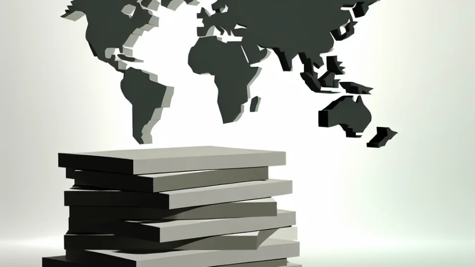
What Are Map Projections and Why Are They Important?
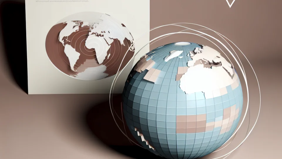
Map projections are techniques used to transfer the three-dimensional structure of the Earth onto a two-dimensional surface. These projections aim to minimize various distortions caused by the Earth's round shape. Different types of projections are designed according to different criteria to accurately present geographic information. For example, some projections focus on preserving area, while others concentrate on preserving angles or distances. Therefore, each projection has its own unique advantages and disadvantages.
The Earth's round structure makes it challenging to create maps with correct proportions. For instance, the Mercator projection accurately represents areas around the equator but creates significant distortions in polar regions. This can be misleading in perceiving the actual sizes of countries and regions. Map projections use various techniques and mathematical calculations to overcome such issues. This necessitates the selection of the most suitable projection based on the intended use of the maps.
To understand the importance of projections, it is essential to evaluate the use of technologies such as geographic information systems (GIS). GIS analyzes complex geographic data using various map projections and layers. This allows users to better understand events like earthquakes in a specific area. For example, when creating an earthquake map, the choice of the correct projection is critical to accurately reflect the effects and spread of the earthquake. This is a vital factor for emergency management and disaster planning.
In conclusion, map projections are used in many fields, from geopolitical analyses to geological research. Each projection serves a specific purpose, making the selection process quite important. Using the correct projection allows for accurate interpretation of data. Map projections not only provide an aesthetic image but also help users effectively understand geographic data.
What Are the Differences Between the Equator and the Poles?
The shape of the Earth is in the form of a geoid, which is bulging around the equator and flattened at the poles. This causes a difference in the distance between the equator and the poles. On maps, these differences lead to a misleading appearance of the sizes of countries and continents. For example, areas near the equator appear wider, while areas near the poles appear narrower. This is an important factor that complicates accurate measurement in map projections.
The distances between the equator and the poles are determined by geodetic calculations. While the equator represents the widest point of the Earth, the poles exhibit a narrower and more compressed structure. This affects the appearance of countries on the map. For instance, Greenland appears large on maps, but it is actually much smaller than the continent of Africa. Such distortions become more pronounced with the use of map projections.
These differences play a significant role, especially in the fields of geographic information systems (GIS) and cartography. Map users must understand the effects of such projections. Additionally, this situation should also be considered in research on issues like global warming and climate change. The differences between the equator and the poles also affect climate conditions on Earth. While it is cold at the poles, tropical climates dominate at the equator.
The Relationship Between Map Scales and Real Sizes
Map scales determine how maps represent distances and sizes in the real world. Map scales are typically expressed in two ways: fractional scale and ratio scale. A fractional scale shows the real-world distance at a specific scale on the map, while a ratio scale is expressed in units. For example, a scale of 1:100,000 means that 1 unit of distance on the map corresponds to 100,000 units in the real world. These scales are crucial for ensuring that maps provide accurate information to users.
The difference between real sizes and sizes on the map is also closely related to map projections. The Earth's round shape leads to some distortions when projected onto a flat surface. These distortions become more pronounced, especially when representing large areas on maps. The map scale is used to balance the effects of these distortions. However, in addition to choosing the correct scale, the type of projection is also important for creating an accurate map.
In particular, the differences in distance between the equator and the poles also affect map scales. Countries around the equator tend to spread over a larger area, while areas become narrower as one approaches the poles. This can cause the sizes of countries on maps to appear misleading. For example, Greenland appears quite large on the map, yet its actual size is much smaller. Therefore, it is vital for map users to understand scale and projection information.
In conclusion, the relationship between map scales and real sizes is a critical issue for accurately interpreting maps. Users need to consider this information to correctly calculate distances and areas on maps. Everything visible on a map presents the complexities and three-dimensional nature of the real world in a two-dimensional format. Therefore, map reading skills are extremely important for obtaining accurate information.
Borders of Countries and Errors in Map Drawing
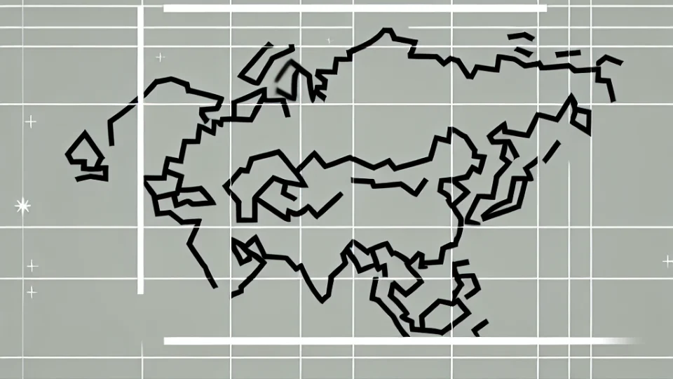
Maps are created by reducing the three-dimensional structure of the Earth to two dimensions. This process can lead to misrepresentation of geographical realities. For example, the borders of some countries may appear larger or smaller due to map projections. In this case, regions with similar countries, especially in terms of size and area, may be represented in different sizes on the map. Such errors vary depending on the type of projection used for the map, making the interpretation of maps more challenging.
The drawing of borders is generally based on historical agreements along with natural geography. However, the geopolitical situations and natural barriers of certain regions can complicate the accurate determination of borders. For instance, in mountainous and rugged areas, scales and details may be lost in map drawing. Therefore, the border lines on maps may sometimes not reflect the actual geographical boundaries, which can misleadingly affect the perceived size of countries.
The diversity of map projections causes the areas and shapes of different countries to appear differently. For example, the Mercator projection shows equatorial regions larger while depicting polar regions smaller than they actually are. This situation can lead to errors in analyses based on geographical information. Especially in education and research, such misrepresentations of maps are of great importance as they can create a false perception.
In conclusion, the borders of countries and their representations on maps vary depending on many factors. Errors in map drawing not only lead to visual misrepresentations but can also influence political and economic decisions. Therefore, it is crucial for users to be informed about the types of projections to accurately interpret maps. By understanding the effects of different projections, it is possible to develop a more realistic geographical perception.
What Are the Most Preferred Projections on the World Map?
The projections of the world map vary when transferring the three-dimensional structure of the Earth onto a two-dimensional plane. These projections determine how accurately and realistically the map will be represented. For example, the Mercator projection is commonly used in navigation by sailors, but tends to disproportionately enlarge the sizes of continents. This can distort the appearance of countries, especially in polar regions, leading to misconceptions. Therefore, careful consideration should be given when choosing a projection.
One of the most frequently used projections on the world map is the Robinson projection. Although it is not entirely accurate, this projection aims to display the sizes and shapes of continents in a more balanced way. The Robinson projection offers a visually appealing map and is preferred for educational purposes. Such projections play an important role in helping students understand concepts, especially in geography classes.
The Lambert conformal projection, on the other hand, is particularly used in aeronautical charts and airways. This projection preserves angles, making navigation easier. However, when this projection is used, the surface areas and shapes of continents may be distorted. Thus, users need to be cautious, especially in terms of map reading and interpretation. Analyzing the purpose of use is crucial when selecting a projection.
Finally, azimuthal projections also hold significant importance on the world map. These projections transfer the Earth's surface onto a flat surface starting from a specific point. Such projections are ideal for polar regions and are frequently used in satellite imagery. However, these projections also contain certain distortions. The differences among map projections are critically important for accurately conveying geographical information.
What Tools Can Be Used to Understand Real Sizes?

There are various tools and methods available to understand the real sizes of the Earth. These tools include modern technologies such as maps, remote sensing technologies, and geographic information systems (GIS). Remote sensing allows you to examine surface details through satellite images or aerial photographs. This way, more accurate information can be obtained about the real sizes and shapes of countries and regions. Especially details like coastlines and natural boundaries can be analyzed more precisely thanks to these technologies.
Geographic Information Systems (GIS) are powerful tools used for processing and analyzing maps and spatial data in a digital environment. With GIS, various data (population, infrastructure, natural resources, etc.) from a specific area can be compiled. The analyses conducted on this data help to better understand the real sizes and geographical features of countries. Additionally, taking into account the effects of map projections, it is possible to achieve more accurate results through these systems.
The GPS (Global Positioning System) technology used to measure any point on Earth is also an important tool. GPS uses satellite signals to accurately determine locations on the Earth's surface. Through this system, the geographical coordinates of countries and regions can be precisely identified. This ensures that the real sizes and areas of countries represented on maps are reflected more accurately. GPS offers great convenience, especially in travel and exploration.
Finally, online mapping applications and software are also tools that assist in understanding real sizes. Popular platforms like Google Maps and Bing Maps help users better comprehend locations and sizes on Earth. These applications allow users to visualize a specific area by zooming in or out. Thus, users can see the sizes of countries and regions more clearly and make comparisons.
How Does the Earth's Geometric Shape Affect Us?
The Earth's geometric shape can be defined as a geoid. This shape results from the flattening at the poles and the bulging at the equator. This situation can cause the sizes of countries on maps to appear misleading. For example, countries located at the Equator may look larger, while those near the polar regions are represented as smaller. As a result, visual differences on maps can arise, which may mislead people about the actual sizes of countries.
Since maps are generally designed on two-dimensional surfaces, it is quite challenging to accurately reflect the three-dimensional surface of the Earth. Therefore, projection methods are used. These methods create various distortions when transferring the three-dimensional shape of the Earth to a flat surface. For instance, the Mercator projection accurately represents areas near the equator but significantly enlarges regions near the poles. This can lead users to misinterpret the size of areas close to the poles.
Additionally, the scale used on the map also amplifies the effects of the Earth's geometric shape. Different scales affect how we perceive the sizes and distances of countries. Large-scale maps provide more detail, while small-scale maps show broader areas. This situation allows map users to draw incorrect conclusions when comparing various countries. For example, on a small-scale map, the size of Africa may appear as large as a bigger continent.
Finally, the rotation of the Earth is also a factor that affects its representation on maps. The Earth's rotation allows countries in the equatorial region to cover a wider area. This can lead to misleading representations of the sizes of countries on maps. Particularly, countries close to the equator appear larger on maps, while those near the poles seem smaller. Therefore, the Earth's geometric shape and rotation complicate our understanding of the sizes and locations of countries on maps.